A language learning app that helps travelers learn a new language as they roam the planet.
Overview
Created as part of Thinkful’s “Hackathon” where student grads team up to follow a rubric and create the best solution to the problem statement
Tools
Figma, Google Suite, Pen & Paper
Roles & Responsibilities
User Research, UI Building, Asset Creating.
Problem
Create an educational platform for lifelong learners, offering personalized learning experiences
Solution
We created an app that allows users to learn a language while traveling, while choosing the preferred learning style.
Process
Discover
Grading Rubric
“How Might We” notes
SWOT Analysis
Define
Journey Map
User Persona
User Stories
User Flow
Ideate
Idea Sketches
Create
Digital Prototype
Wireframe
Discover
Grading Rubric & Design Prompt
Me and a team of 3 developers and 2 other designers were tasked with creating a personalized educational platform for lifelong learners, that integrates an AI component. Our work was to be judged and compared with other teams of graduates as a part of the Fall 2023 Hackathon.
“How Might We” Notes
I started with “How Might We” notes, in order to address the specific problems defined in the rubric, and come up with viable solutions.
SWOT Analysis
From that point, we decided to go with a language learning app, so me and the team created SWOT competitive analysis of three major language learning apps on the market.
Define
We found the most viable solutions to the challenges we faced in this design sprint, so we went a bit deeper to define our potential users and map out some routes they’ll be able to take to navigate through the app.
User Persona
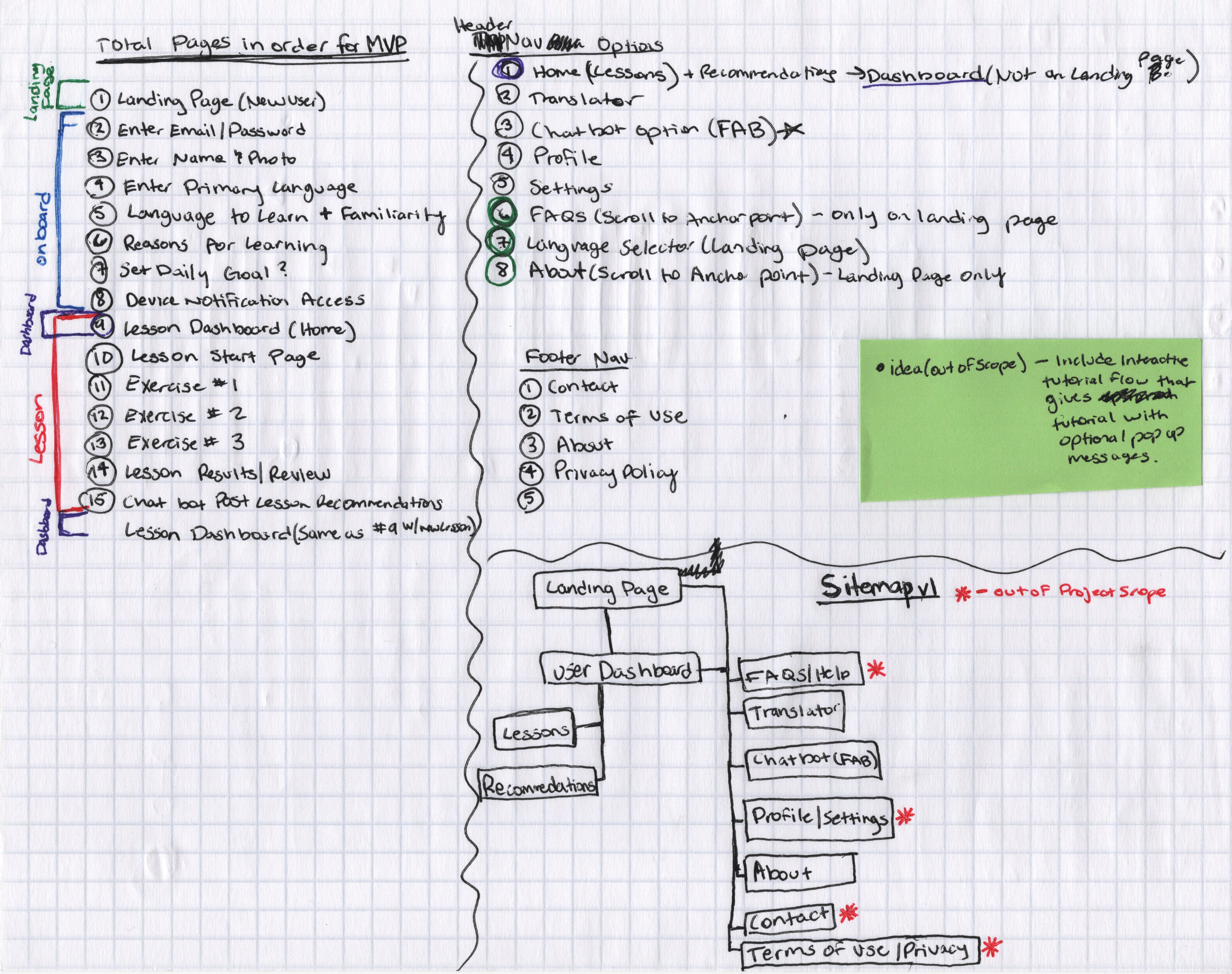
Information Architecture
User Flows:
Site Map Sketch:
Journey Map
Ideate
At this stage we started sketching more ideas about how things should flow and fit to have an idea of how our wireframes should look and feel
Dashboard Sketch
Exercise Sketches
Create
After our ideas were put down on paper we decided to start the creation phase and get our wireframes right in order to create the MVP prototype.
Wireframes
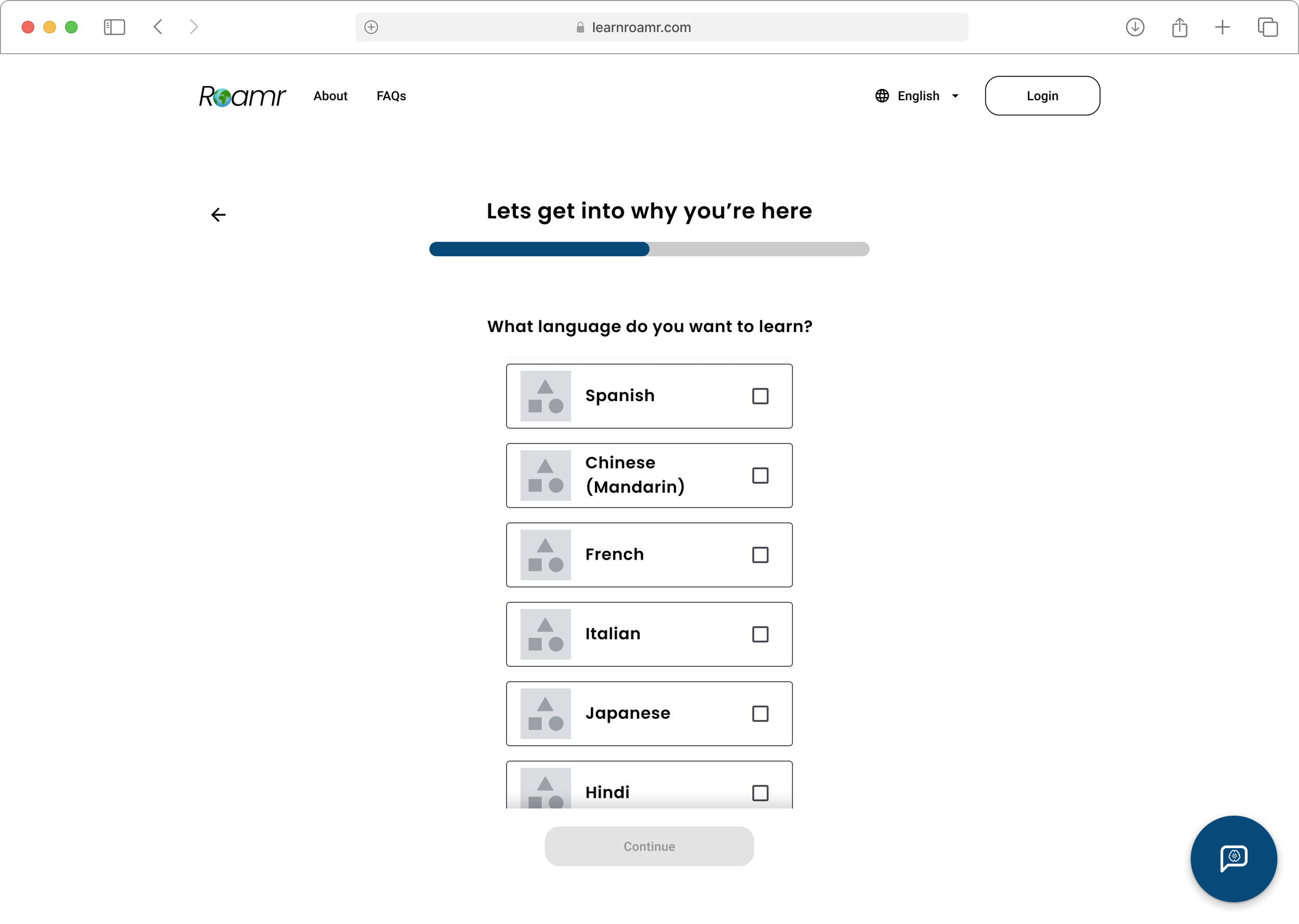
We sectioned our wireframes into Onboard Flow, Dashboard, and Lesson Flow. We used a grid system to assist in the placement of our content, and also added the AI assistant option in the bottom right corner. Below are some screens from the initial wireframe.
Style Guide
For the branding and aesthetic of our app, we chose to go with a simple and universal design style. We chose the Poppins light italic font for the logo with an animated globe replacing the “O” in “Roamr”. We wanted the italic style to show movement, and we chose the name from a list of names with the help of AI.
I chose different variations of Blue and Green for the primary colors because of the Earth, very befitting of a world traveling language app. I also checked the accessibility of the colors using a contrast checker and colorblind tool.
Prototype Screens
These are the final screens for the MVP prototype. Using the Material 3 design system, we implemented a cohesive component style for our buttons, icons, cards, and lists. I added an animated character touching the globe on the landing page, every flag for the country each language represents, some emojis in the onboarding process, and medal icons in the dashboard.


